HTML Tutorials - Herong's Tutorial Examples - v2.30, by Herong Yang
Printed Width of HTML Document
This section provides a tutorial example on the printed width of an HTML document. If the content is less than the width of the printed paper, there is no scaling. One inch image is printed as one inch on paper.
By default, Web browsers will adjust HTML document content layout, like wrapping text lines, to make the content width matches the screen width. However, some content elements have minimum widths that can not be reduced, like a long text string with no spaces to break and wrap, a large image, a table row with many columns. Those element will result a page content with a larger width.
When the content that is larger than the screen width, it will display a scroll bar to allow you to scroll the content horizontally. But what will happen if the same Web page is printed on a paper? Will the content be scaled down to fit the width of the paper? Or will the content being divided and printed on multiple pages?
The answer depends on which Web browser and printer you are using. In most cases, the content will be scaled down to a certain degree. If the content is still wider than the printed paper, the extra content will be truncated.
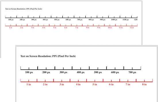
For example, if I open the HTML document described in the previous tutorial, Screen-Resolution-Horizontal-Test.html, with Safari on my macOS computer, and print it on a "US Letter" (8.5 x 11 in) paper, I will get only 1 page of content with 12 inches or 1150 pixels plus margins printed horizontally on the 8.5 inch wide paper.
So the Web page content scaled down about 67% (8 : 12 ratio). And extra content after the 12 inch width is truncated.
Of course, if the page content is less than the paper width, no scaling will be applied. To test out this behavior, I wrote another version of the test HTML document, with less contents:
<!DOCTYPE html>
<!-- Printer-Resolution-Horizontal-Test.html
 - Copyright (c) 2014 HerongYang.com. All Rights Reserved.
-->
<html><head>
<title>Screen Resolution: PPI (Pixel Per Inch)</title>
</head><body style="margin: 0px; padding: 0px">
<h4>Test on Screen Resolution: PPI (Pixel Per Inch)</h4>

<table border="0" cellspacing="0" cellpadding="0">
<tr><script>
for (i=1; i<8; i++) {
  document.write('<td><img src="Image-of-100-x-50-Pixel.png"'
    + ' width="100px" height="50px"></td>');
}
</script></tr>
<tr><script>
for (i=1; i<8; i++) {
  document.write('<td style="text-align: center; font-weight: bold;">'
    + (i*100) + ' px</td>');
}
</script></tr>
</table>

<table border="0" cellspacing="0" cellpadding="0">
<tr><script>
for (i=1; i<9; i++) {
  document.write('<td><svg xmlns="http://www.w3.org/2000/svg"');
  document.write('width="1.0in" height="0.5in" viewBox="0 0 100 50"'
    + ' stroke="rgb(255,0,0)" stroke-width="4">');
  document.write('<line x1="0" y1="48" x2="100" y2="48"/>');
  document.write('<line x1="50" y1="50" x2="50" y2="35"'
    + ' stroke-width="3"/>');
  document.write('<line x1="0" y1="50" x2="0" y2="30"/>');
  document.write('<line x1="100" y1="50" x2="100" y2="30"/>');
  document.write('</svg></td>');
}
</script></tr>
<tr><script>
for (i=1; i<9; i++) {
  document.write('<td style="text-align: center; font-weight: bold;'
    + ' color: #ff0000;">'+i+' in</td>');
}
</script></tr>
</table>

</body></html>
If I open and print this HTML document on a "US Letter" (8.5 x 11 in) paper, I will get only 1 page of content with 8 inches or 768 pixels plus margins printed horizontally on the 8.5 inch wide paper. This time, the content is not scaled at all!
The picture below shows you two examples of horizontal resolution on printed papers. The first one has the HTML document scaled down to 67%. The second one has no scaling.
Conclusions:
- If the Web page content is less than the width of the printed paper, content is not scaled at all. One inch image is printed as one inch on paper.
- If the Web page content is slightly larger than the width of the printed paper, the content will be scaled down, until about 67%, to fit the paper width.
- If the Web page content is much larger than the width of the printed paper, the content will be scaled down for 67%. Any extra content will be truncated (or clipped) horizontally.
- When horizontal clipping occurs, all contents, text and images, will be cut in half along the right edge of the paper.
Table of Contents
Introduction of HTML5 Features
HTML Document Structure and Content
HTML Document and Elements Syntax
►Displayed and Printed HTML Documents
Differences between Displayed and Printed HTML Documents
Default Font Family and Font Size
►Printed Width of HTML Document
Printed Height of HTML Document
Text Paragraph Block Size and Overflow
Pagination Control of HTML Documents
Responsive Design of Web Pages